OVERVIEW
role
UX/UI Design Internship
Responsibilities
User Interface Design
Low-fidelity wire-framing
High-fidelity layouts
Contrast Checking
Developer Handoffs
project type
UX/UI Design
project duration
May 2025 – Present
DESIGN TOOL
Figma
SITUATION
Towards the end of my Spring ’25 semester, I was offered to join the company “Alchemy Software LLC” as a UI/UX design intern for the summer, a very small company specialized in software development.
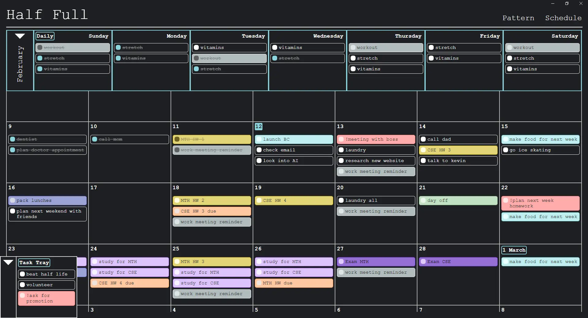
Over the summer, I was working closely with the developer team to improve and innovate the desktop application “Half Full”, a task management productivity tool. During the internship, I tackled a dual challenge: to visually update the interface and to aid in designing new features.
The application functioned very well, but the existing UI required polishing to support future expansions. The interface had a fragmented visual language with traces of clutter and misalignment, and a lack of infrastructure for scalability.
My main responsibilities were to:
- Redesign existing UI of elements and features
- Conceptualize and design new features alongside developers
The goal is to deliver the app updated visuals with cohesive and streamlined design, making usability more intuitive and the experience more memorable while minimizing user friction.
At Half Full, our Design Philosophy is to give the user full control and to make every path from A to B as short as possible.
Aidan Keighron, Founder of Alchemy Software LLC
OLD UI
My first step in redesigning old UI was to conduct an audit to identify any available information of what works, what’s inconsistent, pain points, etc.
SETTINGS UI
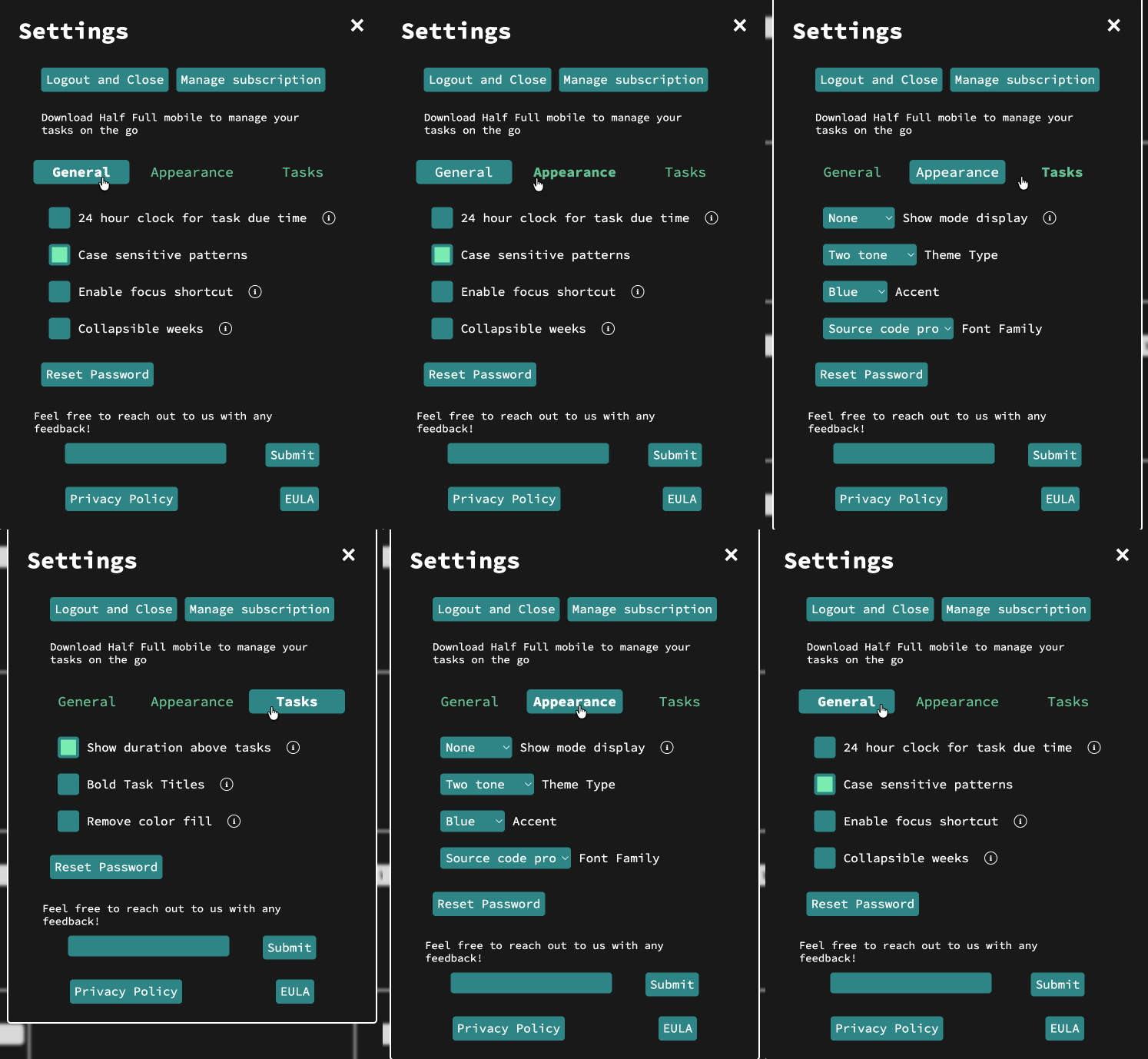
Lack of alignment among elements, making UI harder to scan because of a disordered flow.
UI presents no opportunity for scaling to accommodate introduced features.
Relevant information is disconnected, increasing cognitive load because of scattered element relationships.
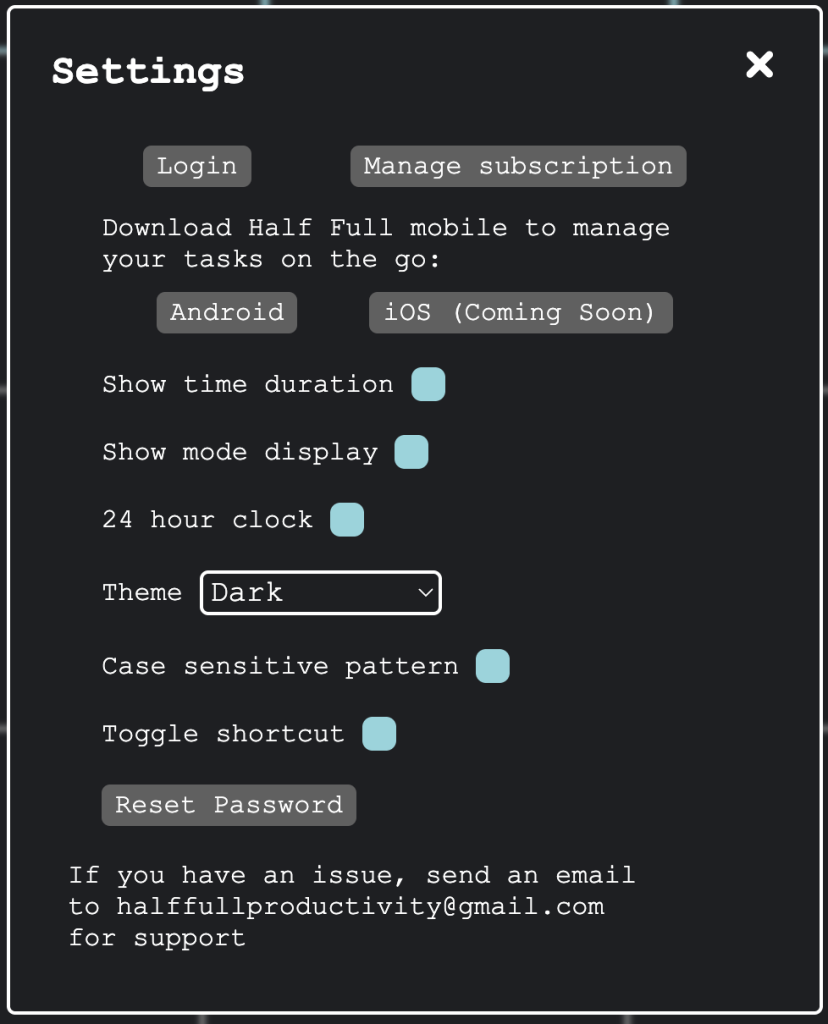
Created a layout for elements to be aligned, bringing visual clarity.
Introduced a page system for scalability and information grouping that reduces cognitive load and improves usability.
PATTERNS UI
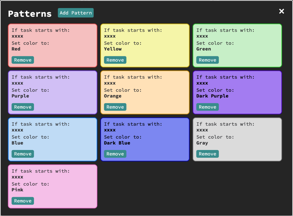
Interface lacked scalability for pattern configurations.
Selection of pattern color were visually underwhelming and created large contrast issues.
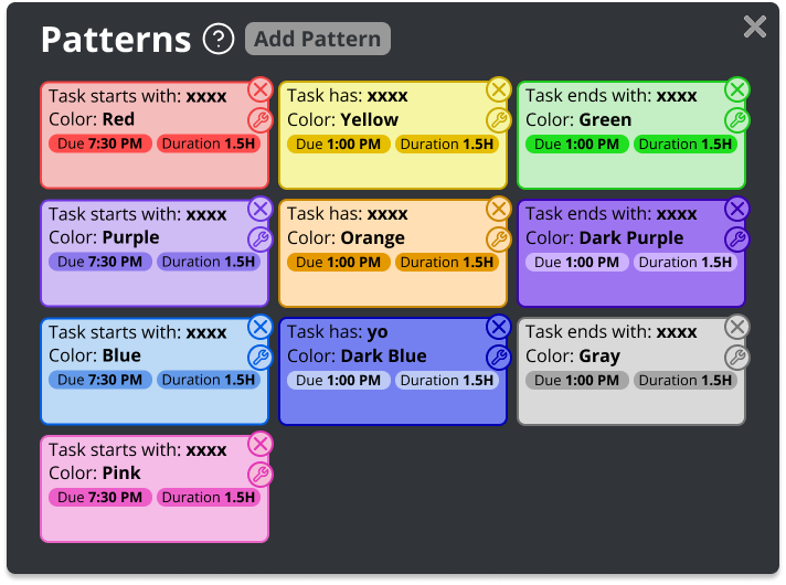
Added UI to allow for quick and intuitive pattern editing, with a “tags” feature that displayed active configurations.
New color selections alleviated the lack of contrast among respective pattern colors.
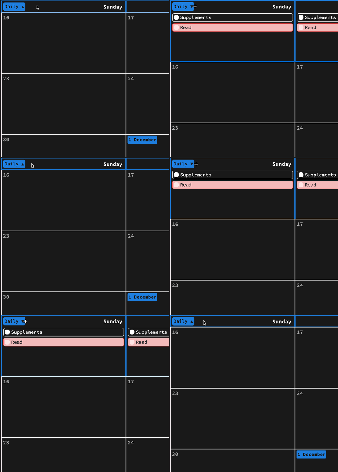
DAILY BAR UI
Daily bar and calendar are misaligned, presenting a disorienting view.
Month name is redundantly repeated and is placed in different orientations, disrupting association of elements and layout alignment.
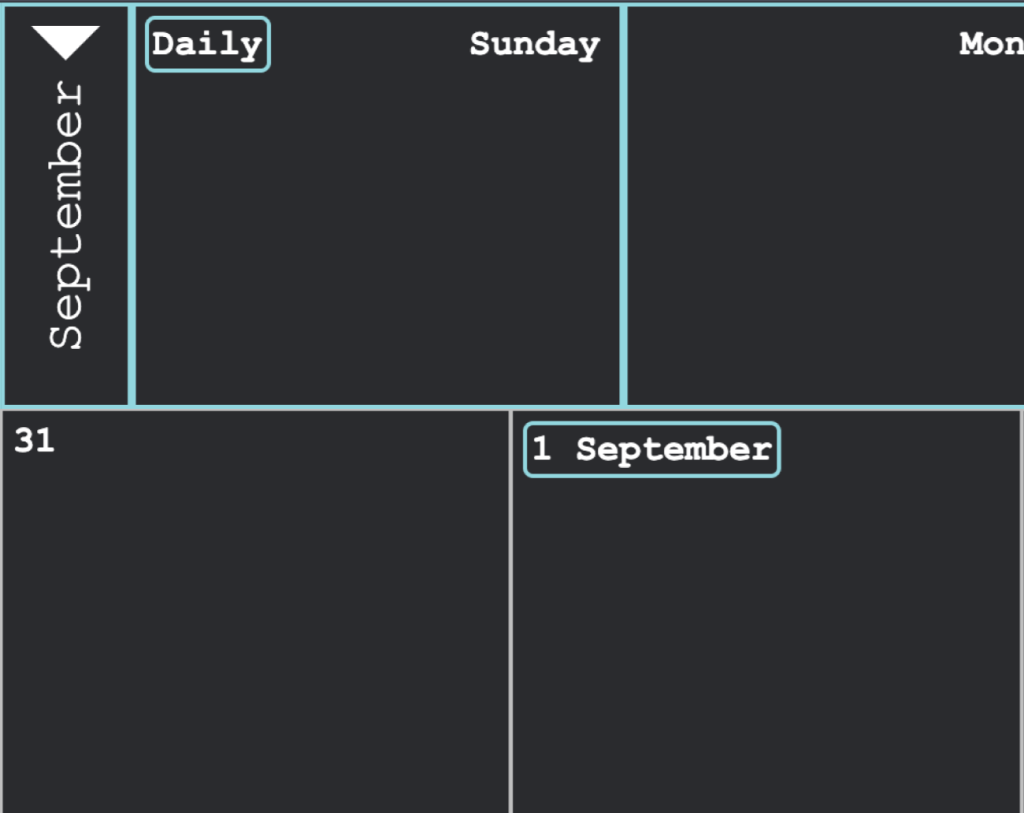
Drop down indicator is now associated with the “Daily” text, making usage more intuitive.
Removed redundancy of the month name placed with daily bar, which realigns the daily bar to the rest of the calendar for visual clarity.
NEW UI
My first step in designing new UI was to assess the available information, then iterating from there by ideating, analysis, wire-framing, etc.
THEME SYSTEM
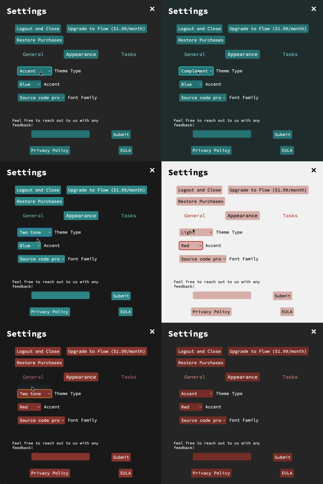
The idea is to provide users with a customizable theme system rather than the preset ones offered, and I proposed color themes based on the HSL color model.
This structure allows for modification of the Hue value so users can select their preferred color while the Saturation and Lightness values remain fixed to maintain contrast.
Theme types change the value of the Saturation and Lightness to meet their intended output of vibrancy, or inclusion of other colors with the “Two Tone” theme.
TASK GROUPING
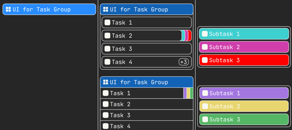
The idea is to give users a system that will expand upon the current task management by allowing users to associate tasks through grouping.
The designed feature allows users to not only group tasks but assign sub-tasks to existing tasks as a stack of tasks.
TAKEAWAYS
Beyond practicing design skills and learning how to use Figma more efficiently with this project, I learned key takeaways about what contributes to the visual experience of a product and designing for future development.
The value of small details
As I examined the interface, I wondered why it was visually jarring. There wasn’t anything divisive about the overall layout or the colors and font used.
On closer inspection, the little details of consistency between elements, alignment, and spacing contributed to an underwhelming visual experience.
The value of designing with scalability in mind
For an application that is actively being developed and implementing new features, it’s important to implement structures that allow for scaling with future development.
With a scalable structure, it saves time on future designing and development, easing the implementation process when a feature is ready.