OVERVIEW
role
UX/UI Designer
Responsibilities
User Interface Design
Low-fidelity wire-framing
High-fidelity layouts
Prototyping
Developer Handoffs
project type
UX/UI Design
project duration
September 2025 – November 2025
DESIGN TOOL
Figma
SITUATION
The “Imagine Software” club at Michigan State University holds a client project program each semester, where clients can approach the club with ideas or prototypes, and the club arranges teams of members to assist the clients in bringing their ideas to life.
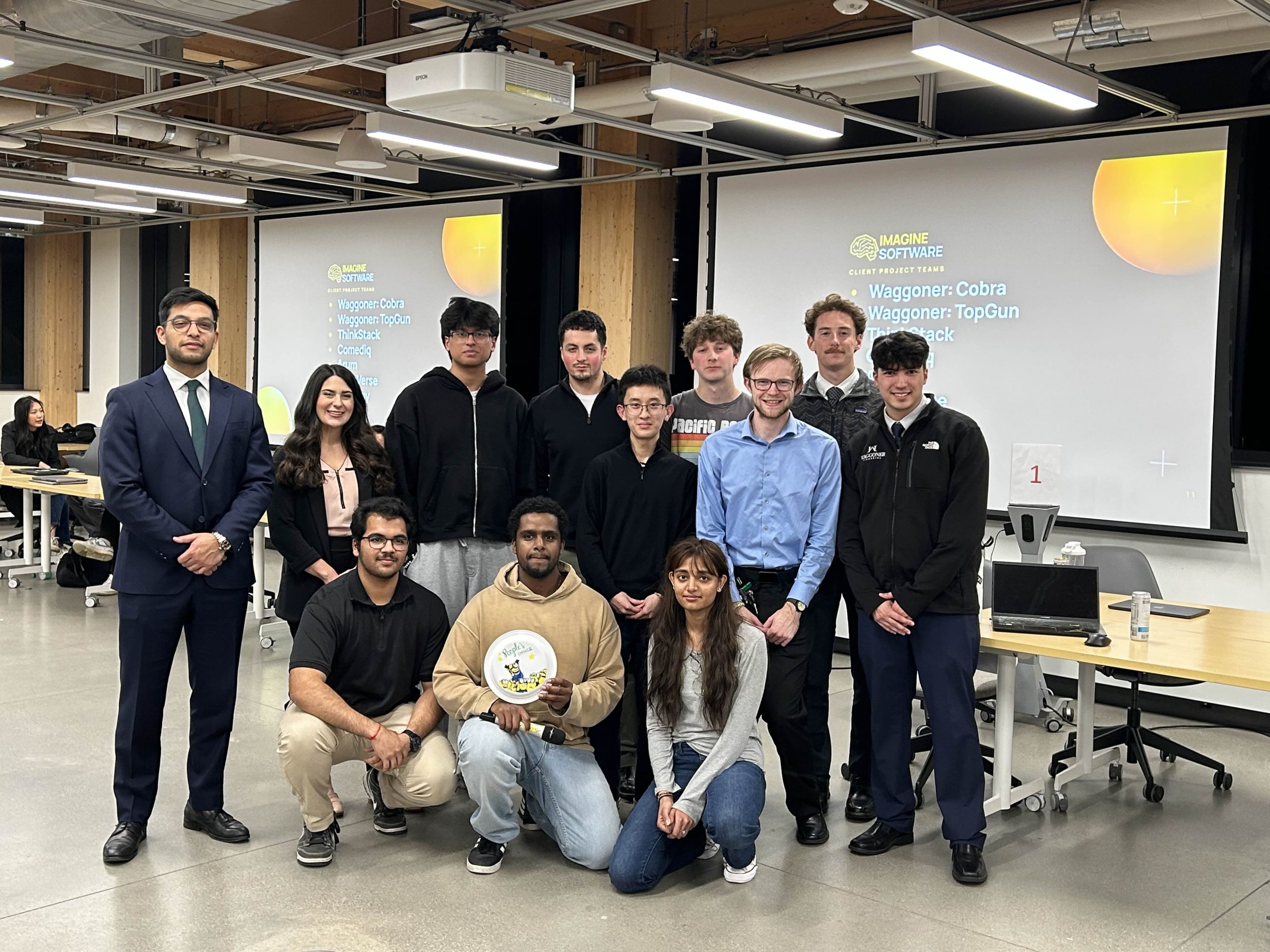
I was selected to work with Waggoner Financial, a financial planning firm based in the Greater Lansing area, to work on their idea “TopGun.”
The idea arises from the issues of the recruiting process such as scattered emails, spreadsheets, and tools throughout the process.
The solution? A centralized data-driven web platform to unify the workload.
My main responsibilities were to:
- Conceptualize and design the user flows + user interface of the hiring team’s recruiting management platform.
- Design the interface for the candidate-facing careers homepage of Waggoner Financial.
The goal is to deliver the client an interface with minimalistic visuals and intuitive interactions to promote efficient navigation of the web platform that eases the workload of recruiting candidates and managing applications.
DESIGN SYSTEM
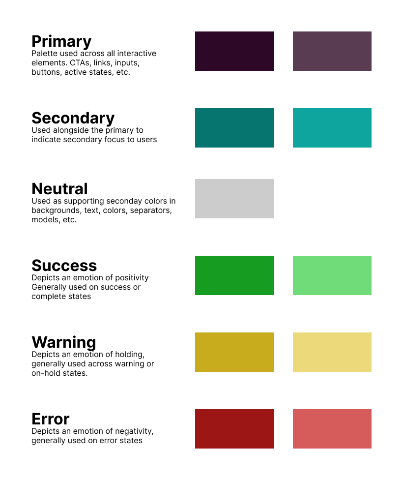
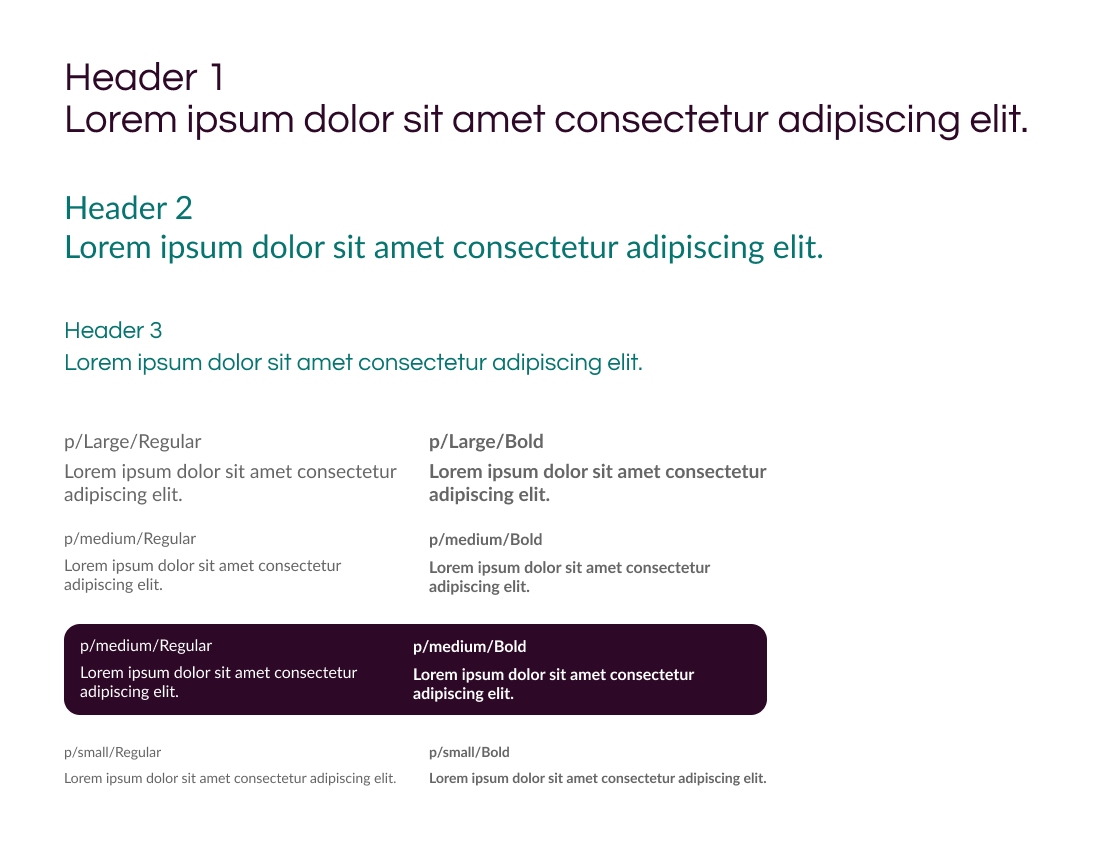
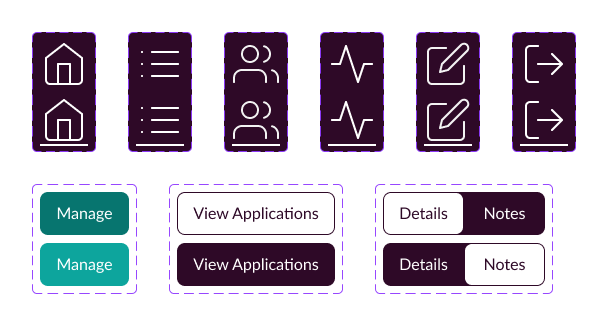
To begin the project, my lead designer and I decided it’d be best to establish a design system.
We were facing a large project for the semester without a pre-established foundation, so we examined the CSS of Waggoner’s existing website to learn how they visually express their identity.
By creating a system, we fostered an efficient workload and visually consistent output. By spending time at the beginning to create the design system, we saved time on potential reiterations of our designs through ensuring element consistency, allowing us to work efficiently without the worry of minute details being glossed over.
RECRUITER PAGES
The hiring team’s web platform was the bulk of this project. For their side, we had to design the dashboard unifying the analytics, job listing management, and applicant management.
Our design was driven by two principles: efficiency and clarity, to deliver our clients a satisfying product that will boost their workflow.
ITERATING
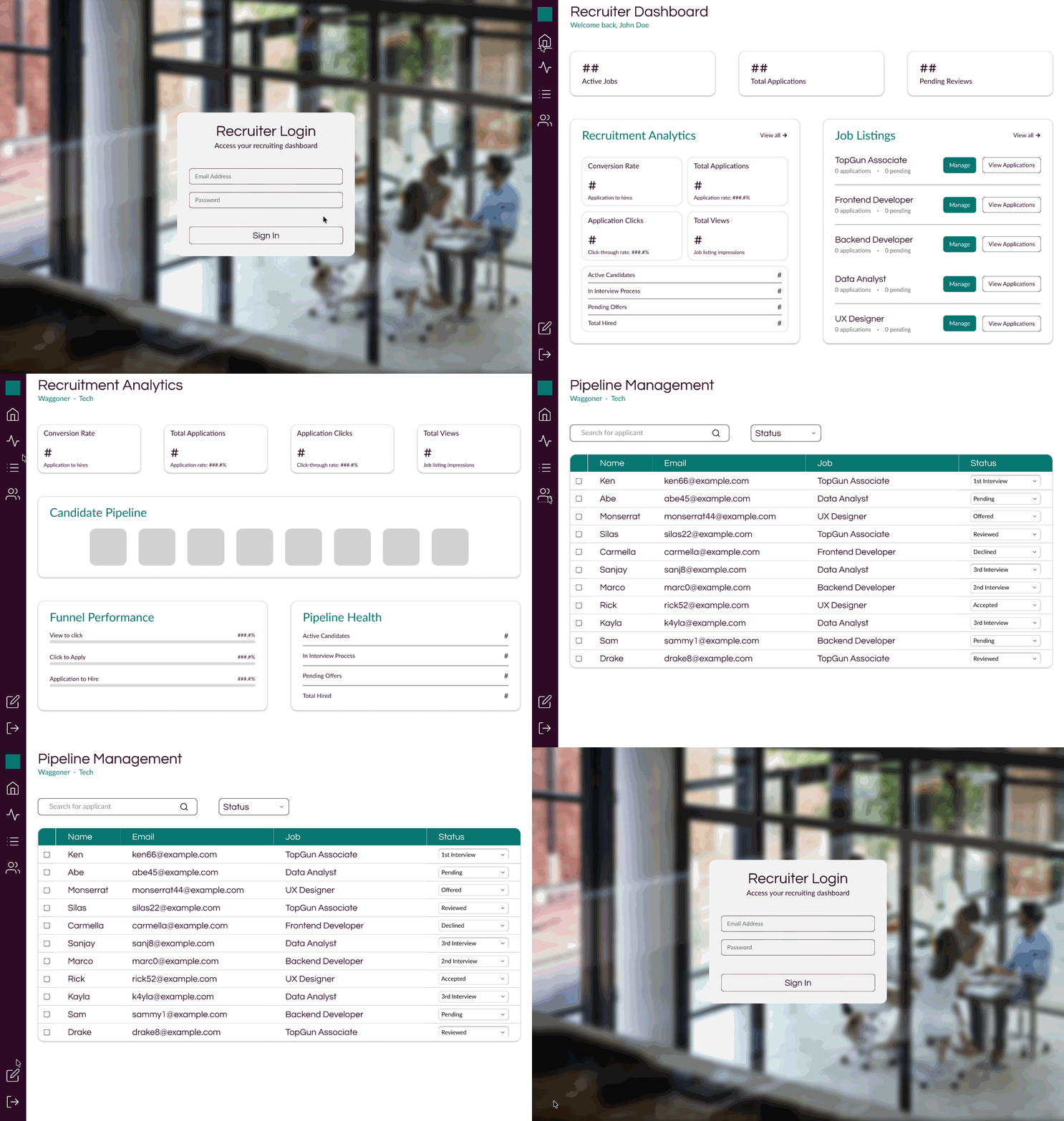
Iterating our designs played a crucial role in meeting the client’s expected output, but beyond that, our iterations pushed us to think of designs that would bring greater satisfaction rather than providing a solution that would suffice for expectations.
The basis of our iterations were, “How can we further effectively communicate information?”
For a product that centers around handling and presenting data, it’s valuable to make key interactions and details visually appealing while minimizing the possible clutter that can cognitively load the user.
Finished designs must be responsive and adaptable, and so do the processes behind them.
By iterating our designs, we were evolving in our workflow to ensure pain points were addressed to uphold usability.
Refinement pushed us from initial assumptions of how the output should look, towards an understanding of how the designs’ outcomes will bring value.
RECRUITER DASHBOARD
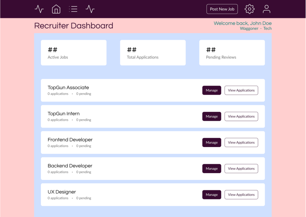
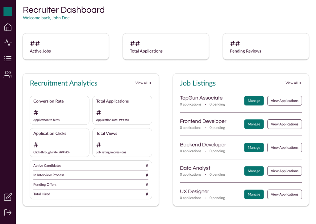
Opted for a sidebar navigation rather than top bar, leveraging horizontal space to be used for widgets that communicate information and offer shortcuts to parts of the platform
APPLICANT PIPELINE
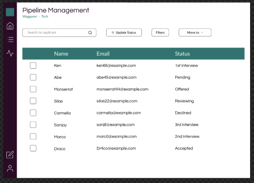
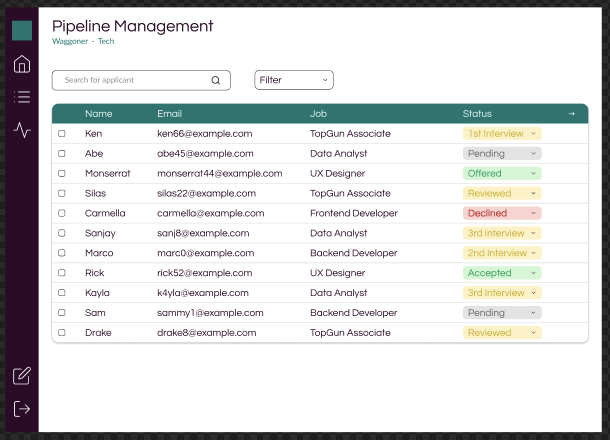
Color coded applicant statuses serve as visual cues to effectively communicate information and dropdown functionality allows users to quickly change applicant status.
JOB LISTING MANAGEMENT
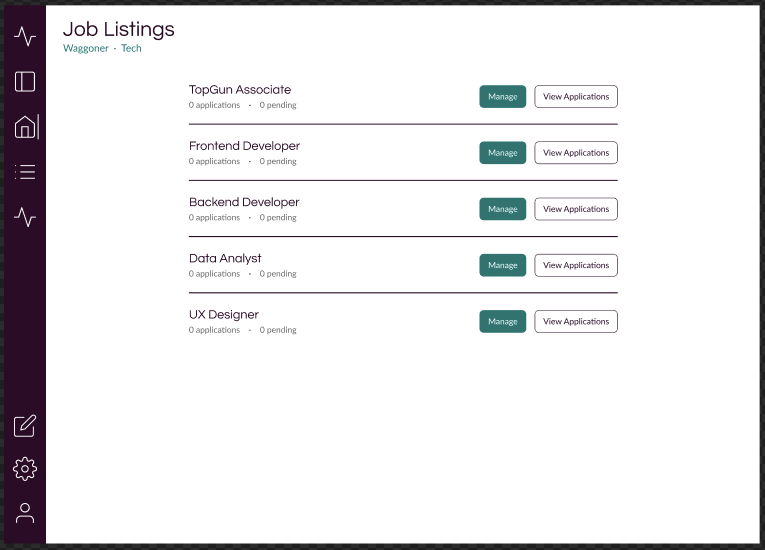
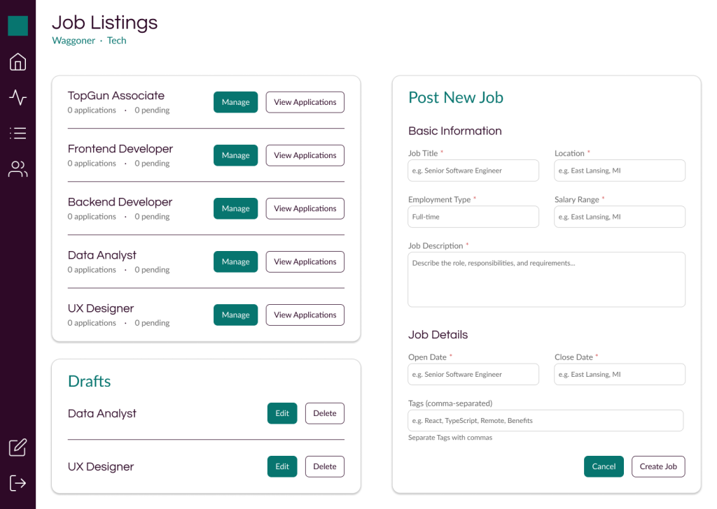
Job creation was formerly a separate page, and unifying it with the job listing page coupled with the drafts widget streamlines the workflow for users by grouping relevant interactions and information making usability more efficient.
APPLICANT MANAGEMENT
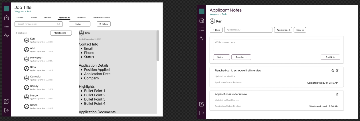
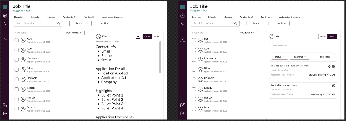
Applicant notes were initially a separate page, but integrating it into the applicant notes with a tab system groups the interactions and information. This layout also improves navigation for users by keeping the list of applicants accessible as they view details.
TAKEAWAYS
On top of honing my design skills in this client project, I learned key takeaways about the work that goes on behind the scenes of a project, to set it up for success before designs were made in Figma.
THE ALIGNMENT OF IDEAS
This project has taught me that a design decision has value because of its outcome, not the output.
To make valuable decisions, it’s crucial to act on ideas that are aligned with client feedback and expectations, also with the development team.
Through communication with our clients and our development team, we refined designs with real satisfaction and constraints in mind, rather than assumptions that can cost the project time and value.
THE FOUNDATION OF A PROJECT
Beginning the project with a design system supporting us was instrumental in letting us work efficiently under the time constraint of a school semester.
With a system, we worried less about flipping through our designs to reference specifications and instead saved that time and energy to focus on the possible directions we can take our efforts and designs to deliver a quality MVP.